01
A connected visual identity
A purple and green palette, consistent typography and campus photography carry the university’s identity across the homepage and inner pages.
Case study / Higher education
QVO rebranded and redesigned City University’s website. The published experience brings its visual identity, academic programs and admissions journey together, with English and Arabic navigation and direct routes to applications and student portals.
QVO’s role
Full website rebranding and redesign
01
A purple and green palette, consistent typography and campus photography carry the university’s identity across the homepage and inner pages.
02
The academic directory groups programs by faculty, with links to degree pages. Admissions information has its own place in the main navigation.
03
Application links sit alongside admissions guidance and contact options. Existing students can reach their portal from the header, while visitors can switch between English and Arabic navigation.
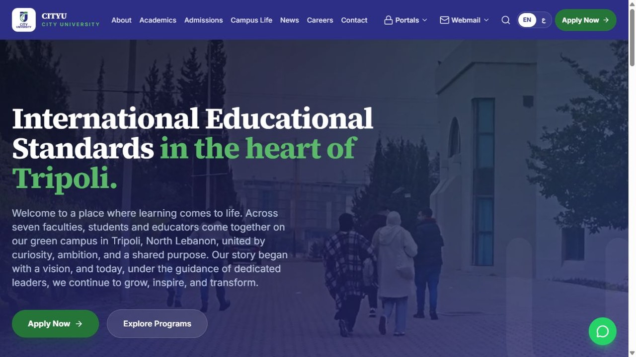
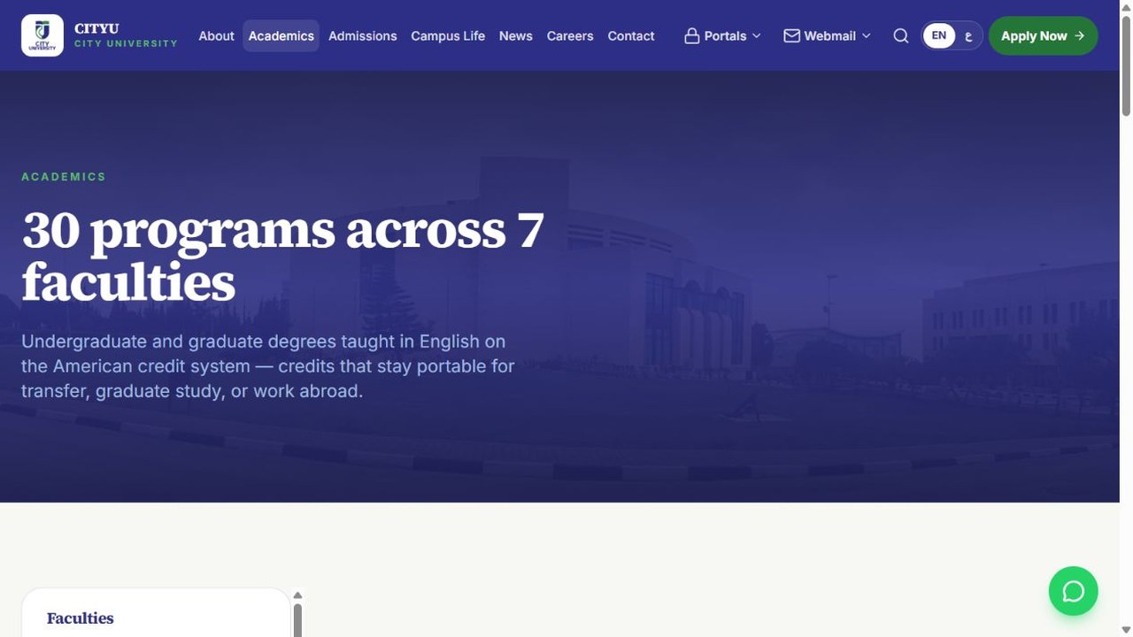
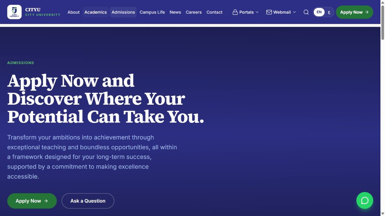
Screenshots from the published website, reviewed on 2 October 2026.
Tell us what your business needs to communicate and what visitors should do next.
Let’s talk